Gothic coloring pages for adults, and why dark art can feel calm
These are coloring pages built around darker subjects (rose windows, skulls, ravens, moths, guttering candles, roses a day or two past their best) and they offer the same quiet, absorbed time any coloring book does. A lot of adults who find cheerful florals a bit sugary get further into a page of tracery or bone. No study has looked at gothic themes on their own. What the research on coloring does suggest is that liking the page matters more than what's on it, so if skulls and stained glass are what you want to color, color those.
Why do dark designs feel calm to so many people?
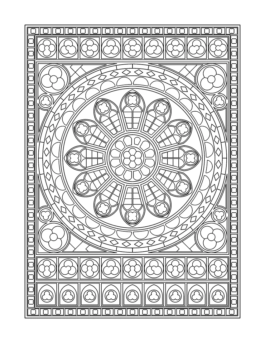
A good deal of gothic art was made to be looked at slowly. Rose windows went into churches where people sat still for an hour while the light moved across the glass, and memento mori images (skulls, hourglasses, candles burning down) were there to make you stop and think for a minute. Some of that pace survives when the motifs are redrawn as line art.
People also just relax differently. Pastel cottages and smiling foxes soothe some of us and grate on others. If your shelf leans toward Shirley Jackson and your playlist toward darkwave, ravens on a bare branch are probably closer to how you'd like to spend a Tuesday night anyway.
And a skull doesn't ask you to be in a good mood, which some colorists say is part of the appeal.
What does the research say about subject matter?
Nobody has tested gothic pages against other themes. Ashlock and colleagues (2018) gave students four quite different coloring activities, and all four lowered short-term anxiety with none doing better than the rest (Ashlock et al., 2018). Eaton and Tieber (2017) found students who chose their own colors stuck at it longer and had a slightly bigger drop in anxiety than students copying a pre-colored version (Eaton & Tieber, 2017). Both point toward choice and enjoyment, which is an argument for coloring what you actually like over whatever a cover calls "relaxing".
How do you color gothic pages so they still glow?
Mostly by not making everything dark. Fill every space with black, aubergine and charcoal and the page goes flat and bruised-looking, and the line work vanishes into it. A few lighter areas are what make the dark ones read as dark.
Real gothic glass is mostly ruby, cobalt and emerald in black lead lines, and it only works because light comes through it. On paper you can fake that by keeping the middle of each pane a shade paler than its edges (press lightly in the center, harder toward the lead line), or by leaving a handful of panes pale gold or plain white. The deep panes next to them look deeper.
For skulls, use ivory, warm gray or a parchment tone; pure white looks cartoonish. The shading goes into the eye sockets and under the cheekbones, with the brow and the top of the skull left lightest, and even two tones of gray will make it look carved.
Gold and silver gel pens are worth having for this. A thin gold line round a halo, a little silver on a moth's wing, a few white dots for candle sparks. Put them on at the very end, once the colored pencil underneath is finished, and keep it to a few touches.
Which colors work for dark pages?
Jewel tones are the easy start: deep red, oxblood, plum, midnight blue, forest green and old gold all sit together well and look rich against black outlines. A quieter option is a page of grays with one accent, dusty rose say, or a single acid green.
Pile oxblood marker on top of black marker and it will soak straight through cheap paper, which is why our books are printed single-sided. Pencil darks go on better in two passes, a pale coat first and real pressure on the second; pressing hard from the start leaves shiny, waxy patches that won't take more color.
What should you look for in a gothic coloring book?
Line quality first. Gothic designs are naturally intricate, but intricate and cramped aren't the same, and you want clean outlines with a mix of big shapes to fill and fine detail to look at. Single-sided pages if you use markers. A larger format gives tracery and petals room.
Some variety helps over a few weeks, since forty identical skulls get old. A book that moves between windows, facades, flowers and creatures holds up better.
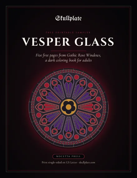
Skullplate's first book, Vesper Glass: Gothic Rose Windows, turns the rose windows, lancets and tracery of gothic cathedrals into 48 original designs on single-sided 8.5 × 11 in pages. The paperback is coming soon to Amazon, and the full book is available now as a $5.99 print-at-home PDF. The second volume, Catacomb Roses, is a sugar-skull book with ravens, moths, roses and cathedral shadows, also coming soon. The free Vesper Glass sampler has five printable pages if you want to try the style first.
Questions people ask
Are gothic coloring books relaxing?
For a lot of us, yes. You get the same quiet as with any coloring book, the phone face down somewhere else and your eyes on one pane of glass at a time. Taste decides the rest. Someone who finds pastel bunnies a bit cloying may sink much deeper into a page of thorned roses.
What colors should I use for gothic coloring pages?
Jewel tones like deep red, plum, midnight blue and forest green work well, with a few lighter areas and some gold or silver for contrast. Avoid filling every space with very dark colors, or the line work disappears.
Are skull coloring pages only for Halloween?
Not at all. Dutch painters were putting skulls on tables in the 1600s, and Día de Muertos sugar skulls belong to early November, not October 31. Nothing stops you coloring one in July.
Pencils or markers for dark pages?
Either. Markers get you deep, even darks fast, as long as the page has a blank back. Pencils are slower, but you can creep up on a dark and stop before you bury the highlight you meant to keep.
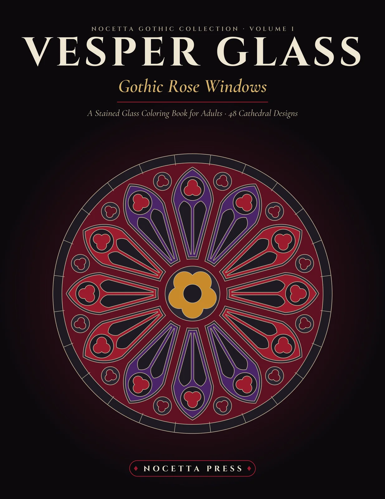
Vesper Glass: Gothic Rose Windows
48 cathedral window designs. $5.99 printable now; paperback coming soon to Amazon.
See the book